Welcome
Poster Series
One message, three visual strategies — and a deliberate refusal to pick just one.
- Discipline
- Poster, campaign
- For
- Hochschule Trier, Fachbereich Gestaltung
- Digital
- 1080 × 1920 px
- A1
Overview
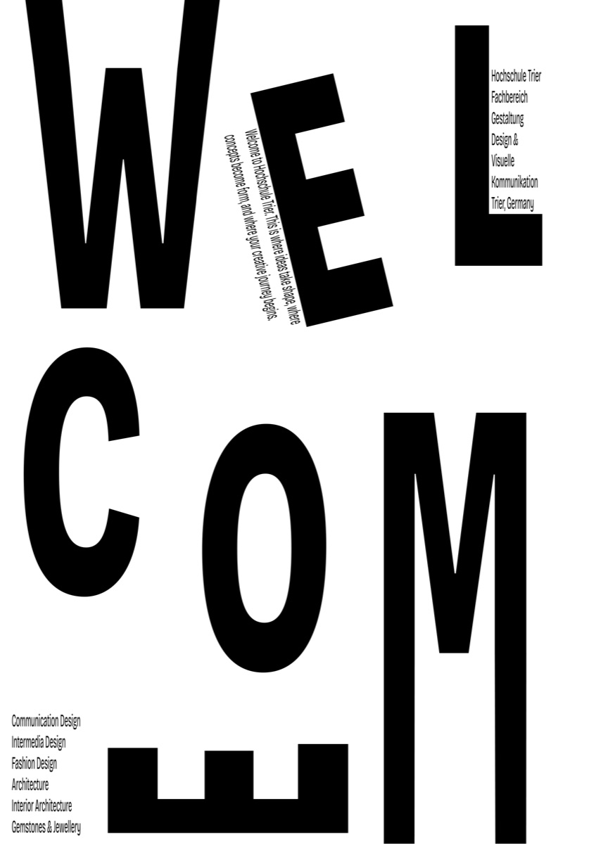
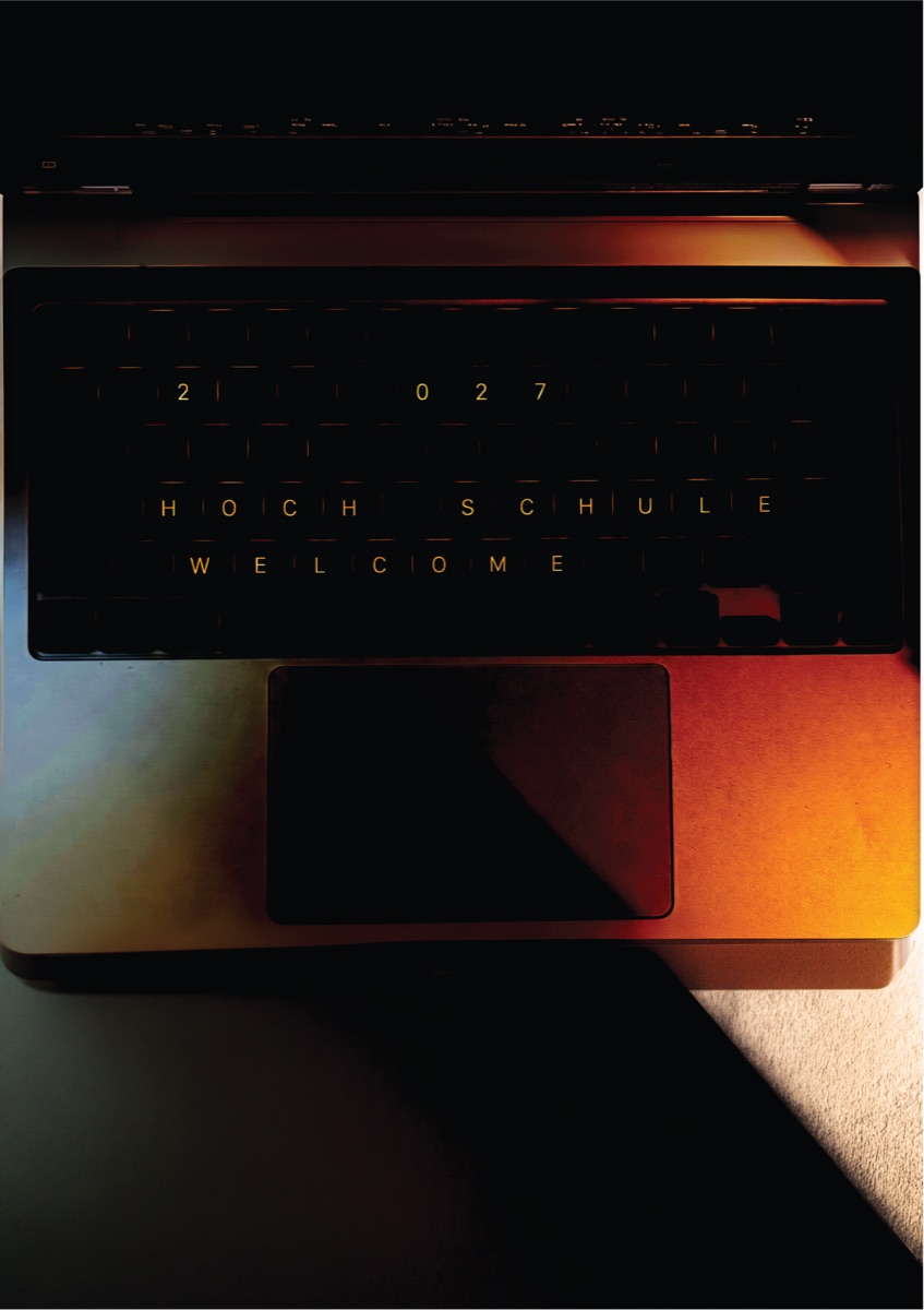
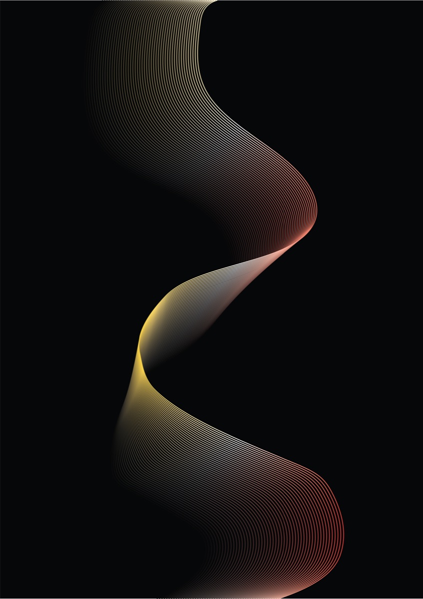
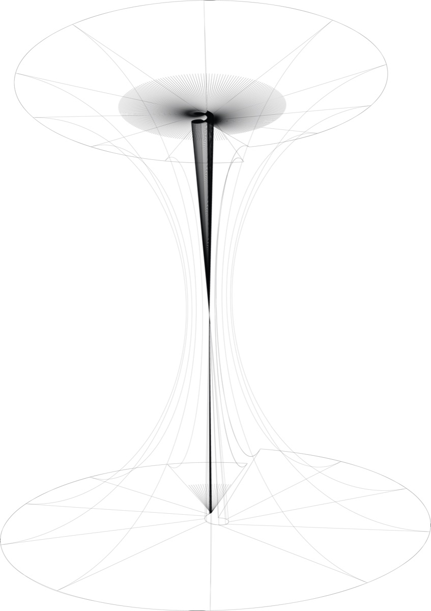
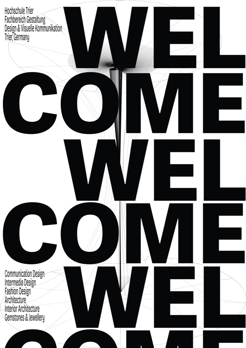
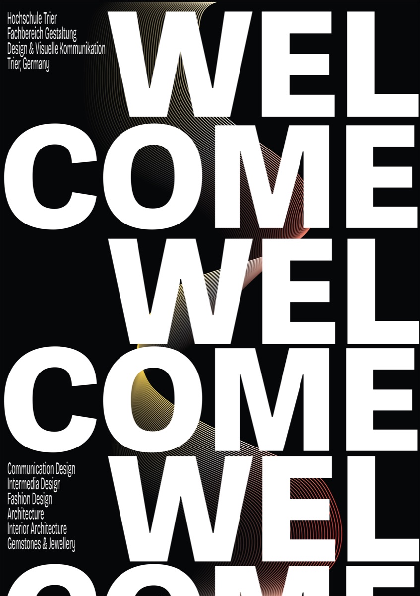
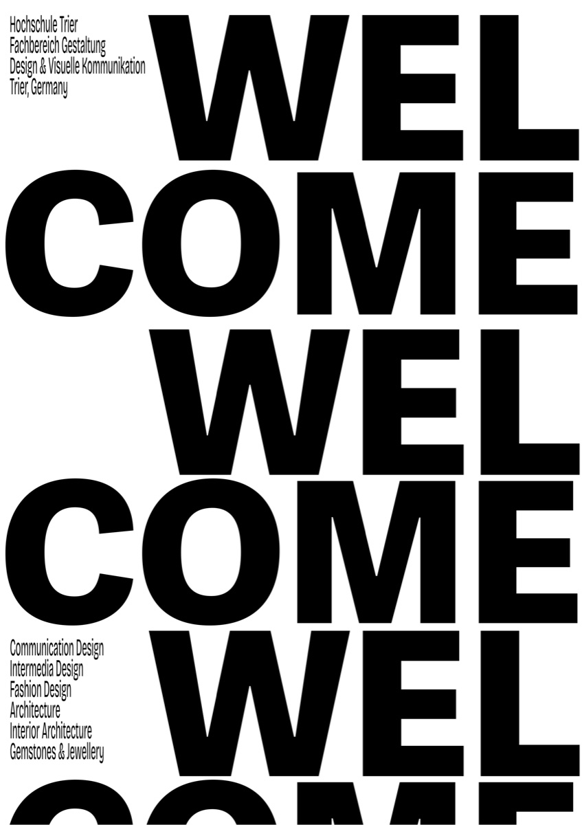
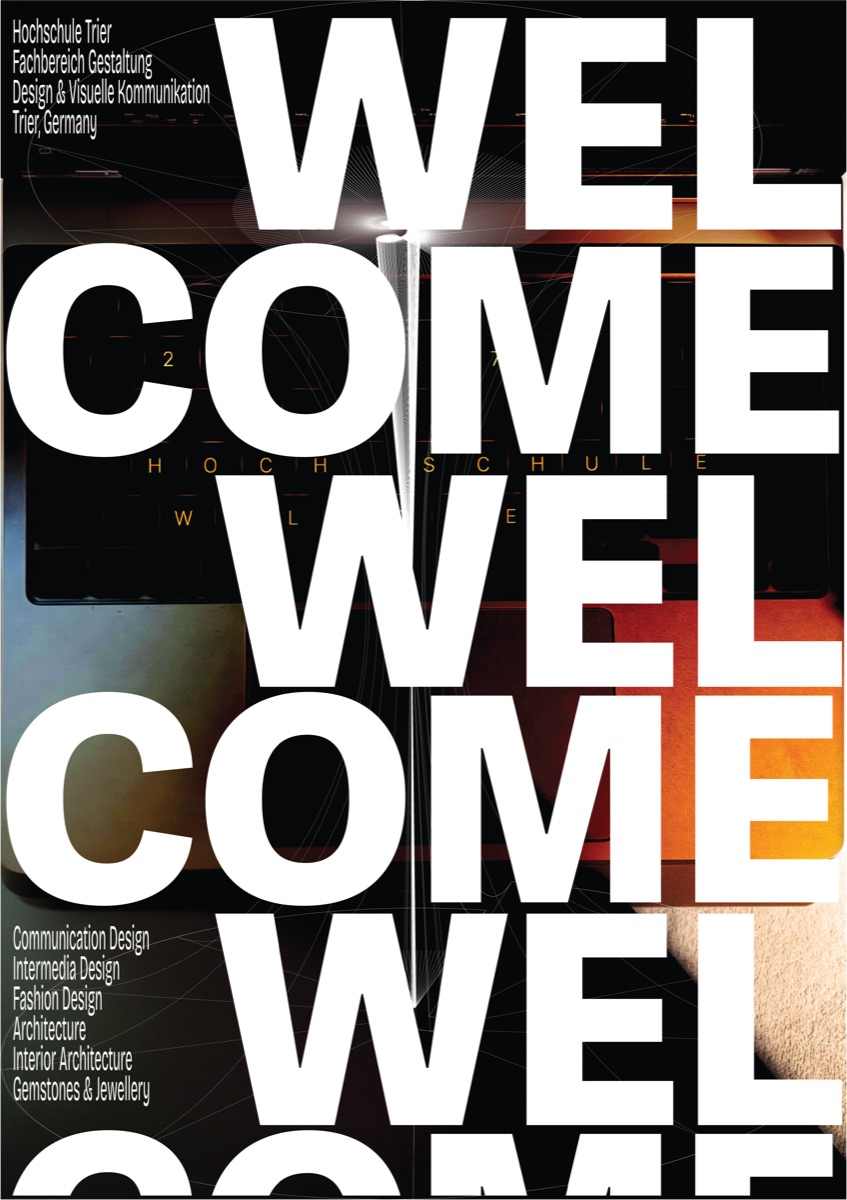
This series welcomes incoming students through three distinct visual approaches to the same core message — typographic, photographic and structural — each carrying the welcome on its own terms while still reading as one family.
Approach
Rather than settling on a single visual strategy, the project treats the brief as a chance to explore range. The typographic route stacks WELCOME until the repetition itself becomes the image. The photographic route lets a lit, low-angle photograph carry the mood and drops the type back to a whisper. The structural route builds the message out of wireframe geometry.
What holds them together is not a shared look but a shared system: the same information block, the same weight of voice, the same discipline about where the message sits.
The series
Details
Each poster was engineered for both screen and large-format print — 1080 × 1920 px for digital and A1 for physical printing — so the series holds up at very different scales and in very different contexts. The information block listing the department's programmes (Communication Design, Intermedia Design, Fashion Design, Architecture, Interior Architecture, Gemstones & Jewellery) stays at a fixed optical size across every variation, which is what lets the set read as a campaign rather than six separate posters.