Creative
Art Center
The one project where I was the client. A full brand system for the pottery studio I founded in Amman.
- Role
- Founder and designer
- Location
- Amman, Jordan
- Scope
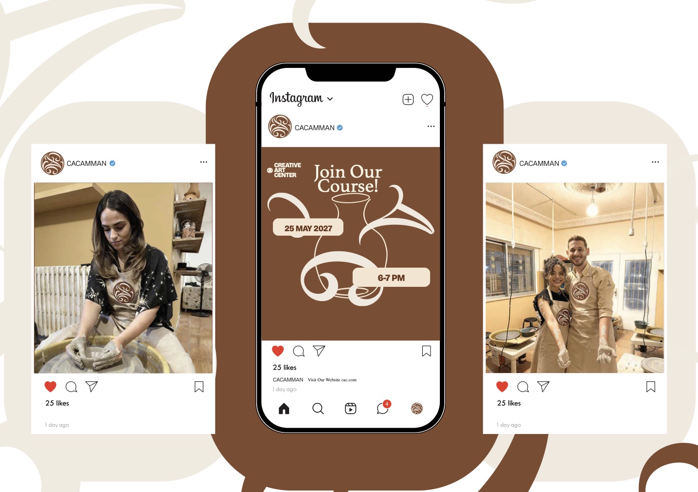
- Identity, packaging, product, social
- Palette
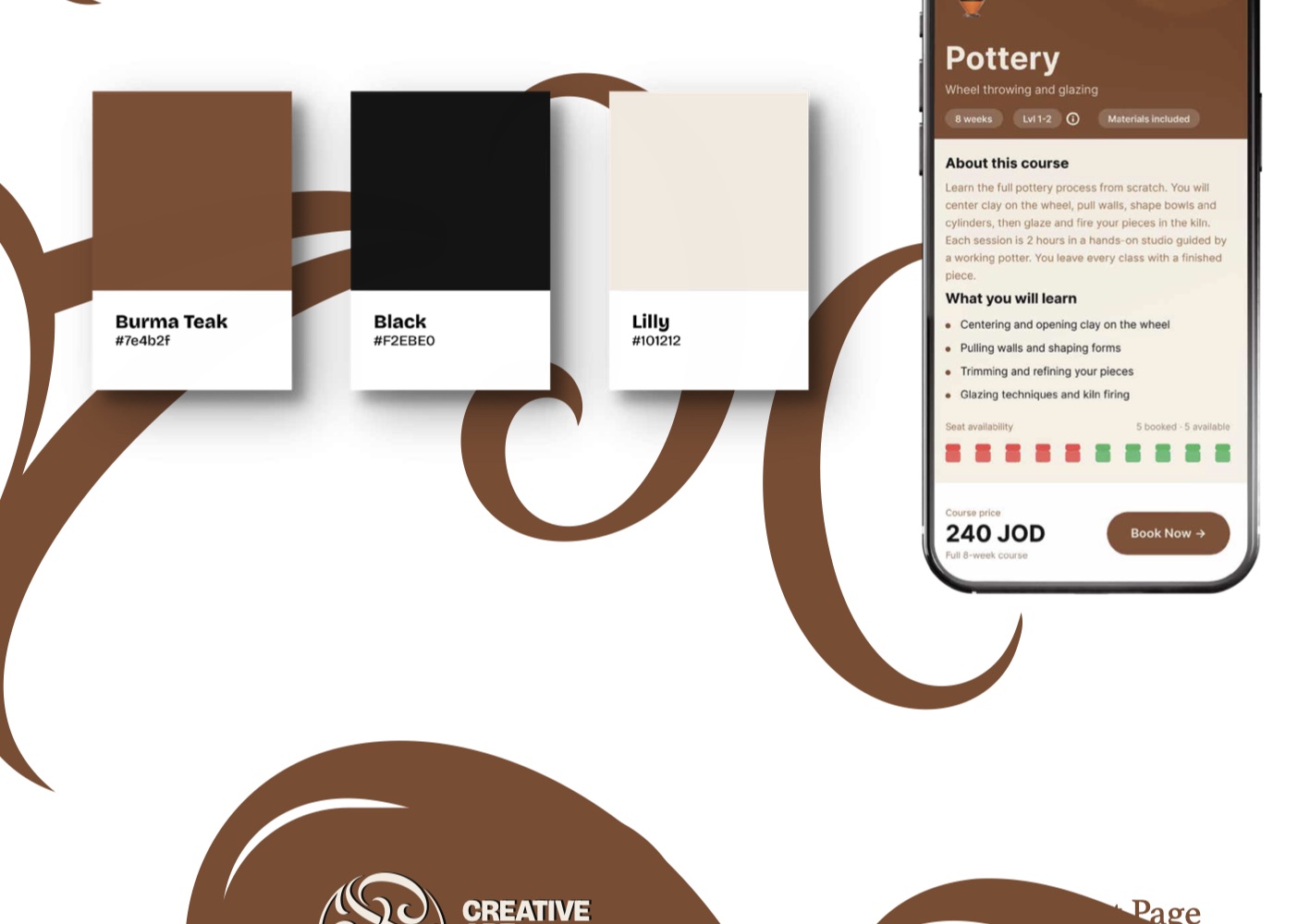
- Burma Teak, Lilly, Black
Overview
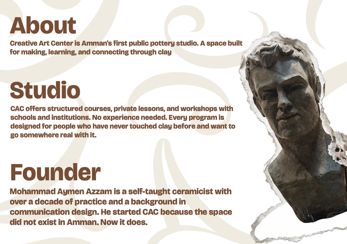
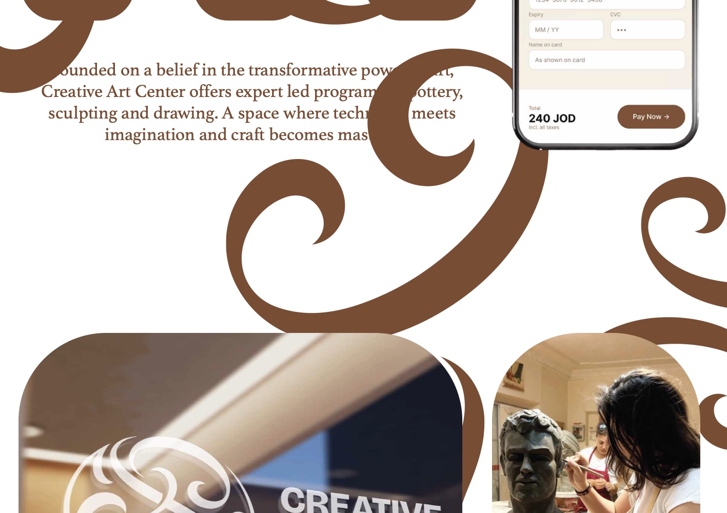
Creative Art Center is a structured-process, private-lesson and workshop studio in Amman built around wheel throwing, hand building and glazing. I founded it, and I designed the brand that carries it — which meant answering to myself as the client, and losing that argument fairly often.
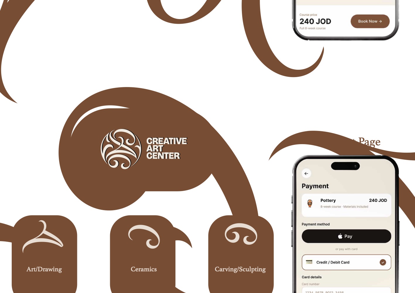
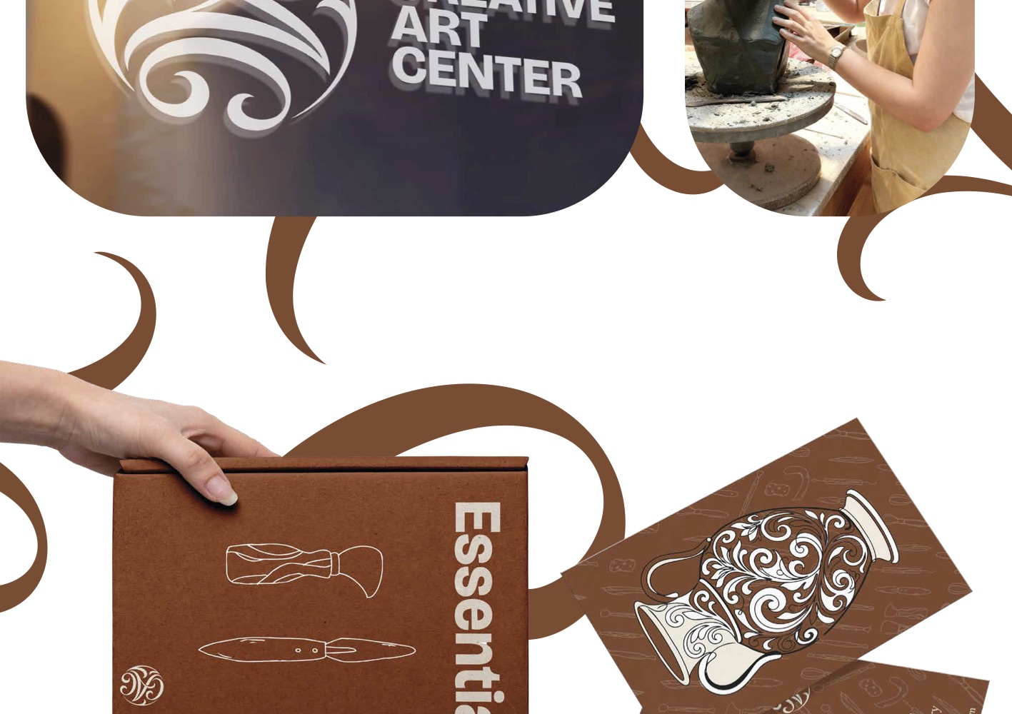
The system runs from the monogram through to the things people actually touch: the essentials kit they take home, the apron they wear in the studio, the stamp pressed into the base of a finished pot, and the booking flow they use to reserve a seat.
Approach
The mark is a continuous line that reads as both a coiled pot seen from above and a thrown spiral — the two gestures the studio actually teaches. It is set in Burma Teak against Lilly, a warm off-white that matches unfired clay far more honestly than a neutral grey would.
Everything below is the brand document itself, exported straight from the working Illustrator file and presented the way it was designed: one continuous vertical read.
The brand document
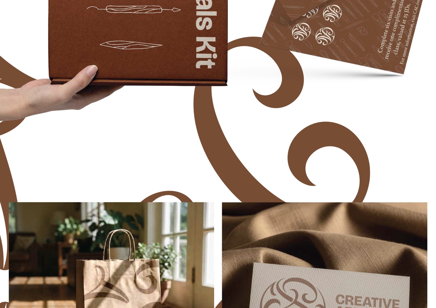
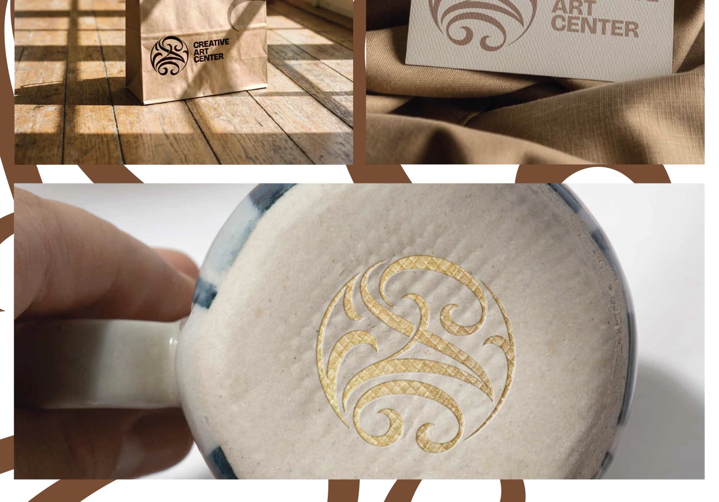
Details
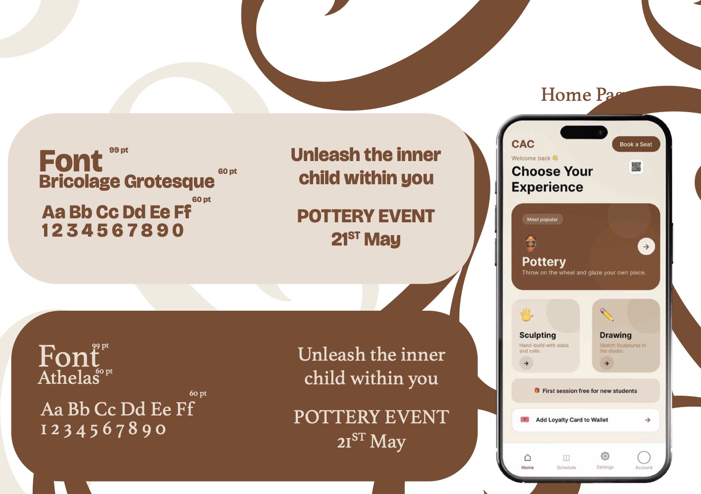
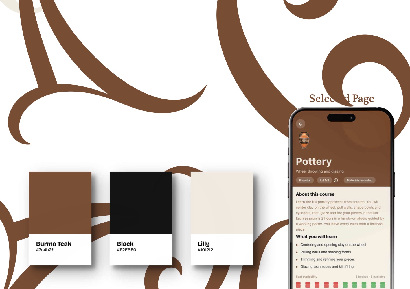
The palette is deliberately narrow: Burma Teak (#7E4B2F) for everything structural, Lilly (#F2EBE0) as the ground, and a near-black (#101212) for text. Bricolage Grotesque carries the whole system — one family, weighted rather than mixed, which keeps a small studio's output looking consistent when it is produced in a hurry between classes.
The booking screens were designed against a real constraint rather than an imagined one: seats per course are limited and fill unevenly, so availability is shown as a row of discrete seat markers instead of a number. You can see at a glance whether the class you want is nearly gone.