Karel Martens
Stationery
A full stationery suite built through the lens of one of graphic design's most distinctive typographic voices.
- Discipline
- Typography, identity
- Pieces
- Letterhead, card, envelope
- Tools
- Illustrator, InDesign
- Palette
- Brick red, deep navy
Overview
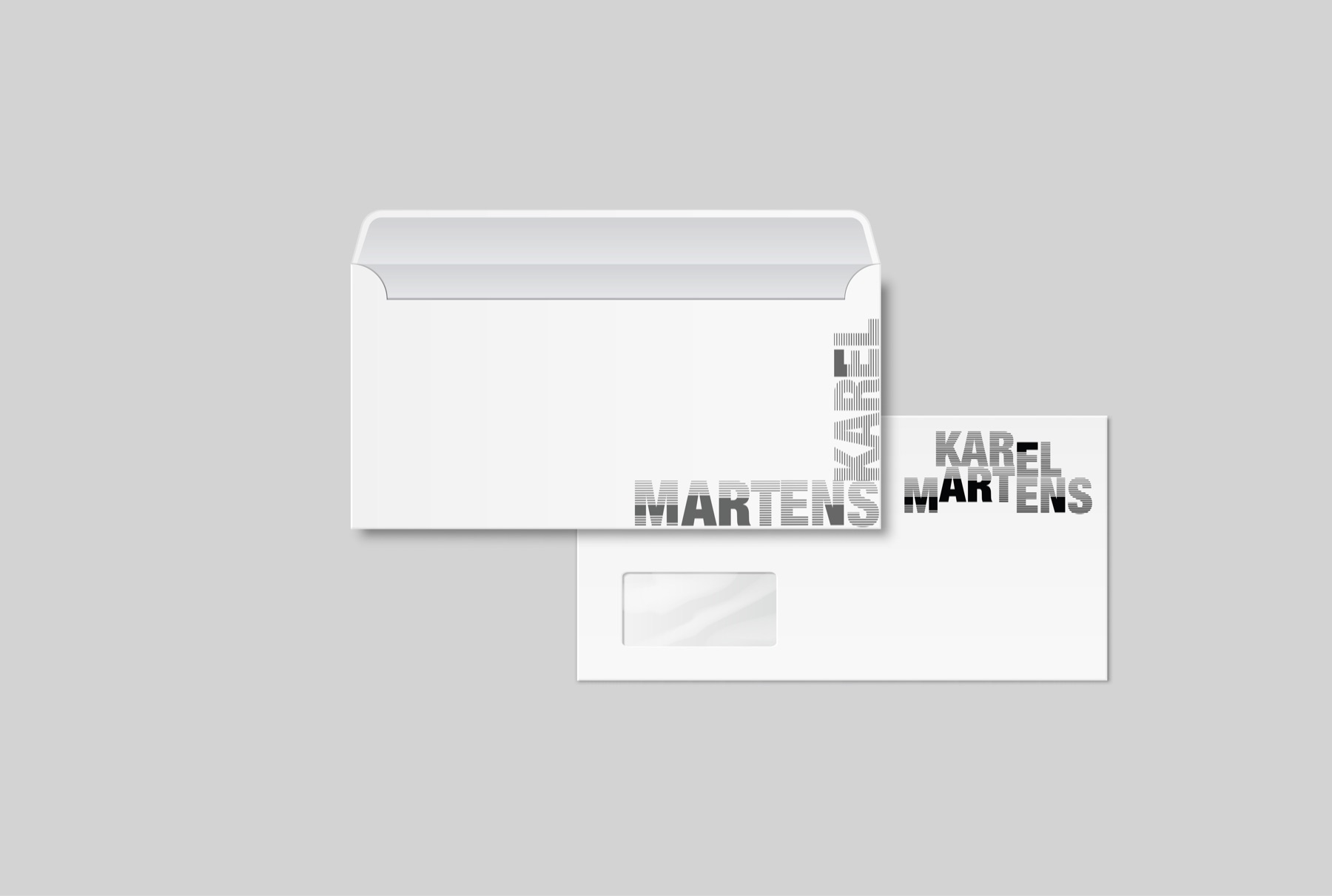
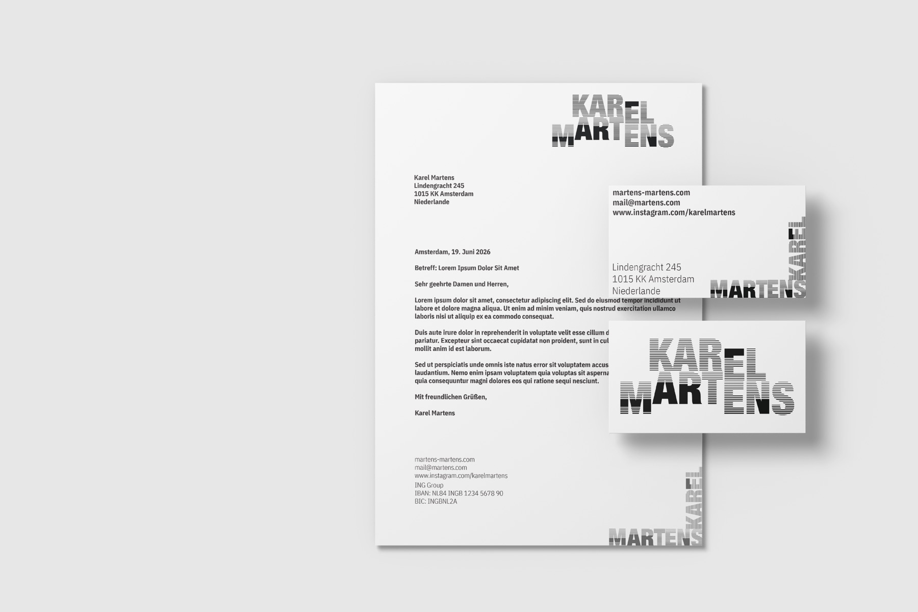
This project reimagines a classic stationery suite — letterhead, business card and windowed envelope — through the lens of Karel Martens, whose letterpress and riso work made him one of the most recognisable typographic voices in Dutch graphic design.
Approach
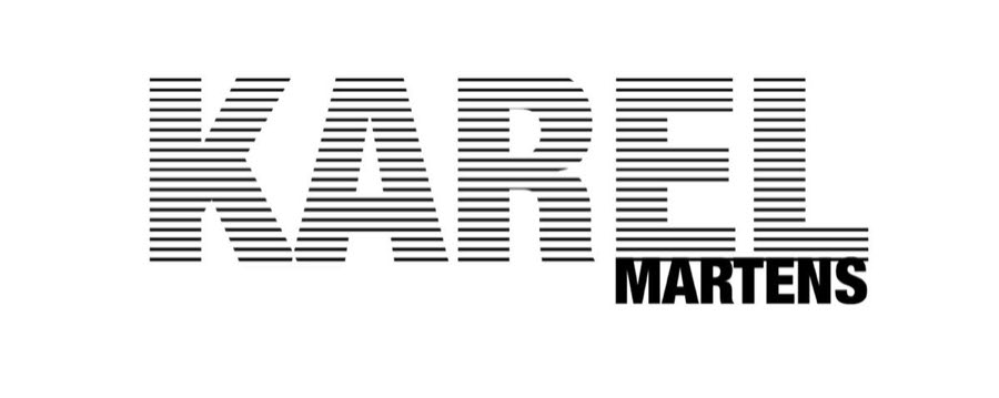
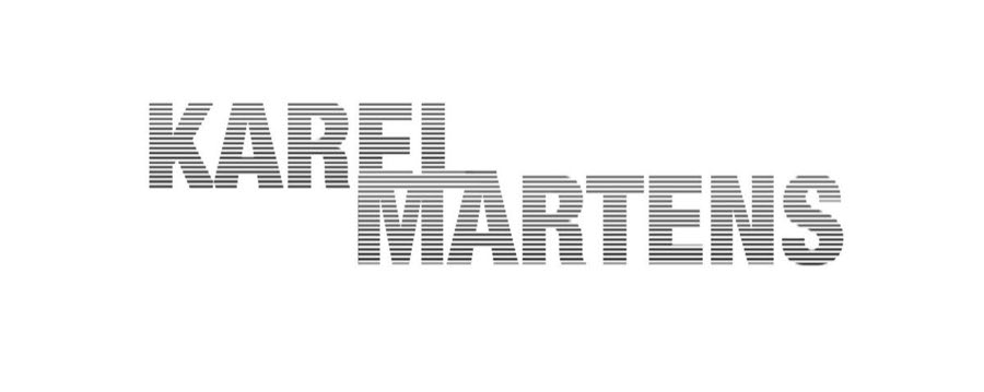
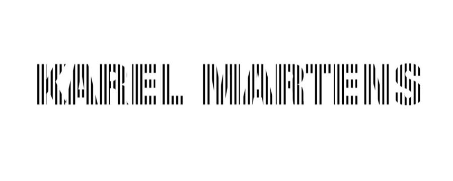
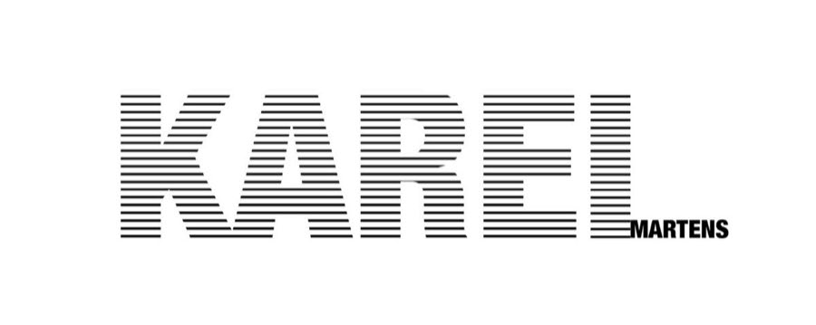
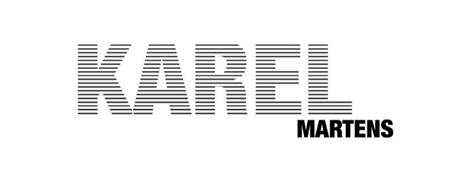
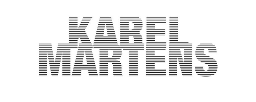
The design leans into Martens' riso-inspired stripe and halftone technique: letterforms cut into dense horizontal bands so the type reads as a printed artefact rather than a digital one. That technique is applied to a confident brick red and deep navy palette, with a condensed grotesque carrying the supporting text.
The brick red and deep navy pairing turned out to be the most portable idea in the project — it is the palette this site runs on.
Wordmark studies
Details
The set includes a DIN A4 letterhead, an 85 × 55 mm business card and an envelope with a window, built across Illustrator and InDesign. Type and address blocks are positioned so the striped wordmark bleeds off the edge consistently across all three pieces, letting the suite read as one system even when the parts are seen separately.
The project was paired with a full designer presentation on Martens' biography, his significant works, and how his practice connects to my own. A companion typographic graphic pushed the stripe and halftone technique further as a standalone piece.